

"Design system" is a big concept, and in this post I will focus on the consistency and theming parts which are also some of the benefits of styled-components. I'll also focus on how to use the styled-components as a JavaScript (TypeScript) tool for design consistency and theming, and these methods would be a good foundation and starting point for building a design system in a React app. Here is what I'll cover in this post:
- Use CSS Variables with Design Tokens: With the benefit of JavaScript (TypeScript), we could use a function to convert all the design tokens defined in JS to CSS variables.
- Write Helper Functions in TypeScript to Get The Benefit of CSS-in-JS: I use TypeScript here because all the tokens are fully typed; we don't need to memorize any name ourselves. Is the color "primary" or "accent"? No more of this confusion. The TypeScript IntelliSense would appear and show all the color variable names (assuming we use an IDE like VSCode).

Here's a demo on code sandbox.
1. Use CSS Variables with Design Tokens
I've put some links about the benefits of CSS variables (aka CSS custom properties) at the end of this article. For this post, I'll focus on how to use CSS variables tailored for styled-components.
One benefit of styled-components is the theming is very easy. Normally with styled-components, we get a color like this:
${props => props.theme.colors.primary}

// or like this:
${({ theme }) => theme.colors.primary}
Then, when we switch the theme, the primary color will automatically change to the one in the new theme. But that's just TLTW (too long to write). And this is a PURE JavaScript way. What about the CSS way? We're writing CSS in the end. Why not find a way to benefit from CSS?
So, here's a better way to write less code and make the CSS more flexible.
1.1 Get Design Tokens as CSS Variables from theme
In the global styles, we define the design tokens like this:
// src/styles/GlobalStyles.ts
import { createGlobalStyle } from 'styled-components';

const GlobalStyles = createGlobalStyle`
	:root {
		/* Color tokens */
		${({ theme }) => createCssProps(theme.colors, '--color')}
	}
`;

export default GlobalStyles;
I'll show what exactly the function createCssProps looks like later, but what it does is convert the colors property, which is defined in a theme object, to the following code.
:root {
  /* Color tokens */
  --color-primary: #4a00ff;
  --color-neutral-300: #e5e6e6;
  --color-neutral-200: #f2f2f2;
  --color-neutral-100: #ffffff;
}
The magic 🪄 here is that when the theme changes, the values of the CSS properties automatically change to the ones in the new theme. Same as the verbose styled-components way.
The generated CSS variables that I can use in the React components like this and easy to customize:
// src/components/Button.tsx

// ... omit the other parts

// ✅ this way
const Wrapper = styled.button`
  color: var(--button-text, var(--color-neutral-300));
  background: var(--button-bg, var(--color-neutral-200));

  ${({ $variant }) =>
    $variant === 'primary' &&
    `
		--button-text: var(--color-neutral-100);
		--button-bg: var(--color-primary);
	`}

  ${({ $variant }) =>
    $variant === 'link' &&
    `
		--butten-bg: transparent;
	`}
`;

// ❌ not this
const Wrapper = styled.button`
  color: ${{ theme }} => theme.colors.neutral-300;
  background: ${{ theme }} => theme.colors.neutral-200;

  ${({ $variant }) =>
    $variant === 'primary' &&
    `
		color: ${{ theme }} => theme.colors.neutral-100;
		background: ${{ theme }} => theme.colors.primary;
	`}

  ${({ $variant }) =>
    $variant === 'link' &&
    `
		background: transparent;
	`}
`;
A theme object is an object for keeping the design tokens, such as:
// src/styles/themes.ts
import { DefaultTheme } from 'styled-components';

export const lightTheme: DefaultTheme = {
  colors: {
    primary: '#4A00FF',
    'neutral-300': '#E5E6E6',
    'neutral-200': '#F2F2F2',
    'neutral-100': '#FFFFFF',
  },
};

// and another theme
export const darkTheme: DefaultTheme = {
  colors: {
    primary: '#747FFF',
    'neutral-300': '#30363D',
    'neutral-200': '#1F2428',
    'neutral-100': '#15191E',
  },
};
When each of these theme objects is assigned to the theme of the <ThemeProvider /> of styled-components' (see in the docs), their values would pass to ${({ theme }) => createCssProps(theme.colors, '--color')}. That's why I said the color values would automatically switch.
In this code sandbox, I create a styled.d.ts file to define the DefaultTheme interface as I wanted because, by default, the DefaultTheme is empty. We can define it any way we want, any way to suit our own project. Such as for a compact theme or a loose theme, we can also put spacing tokens into it.
1.2 The Helper Function to Create CSS Variables
Here is the createCssProps function:
// src/styles/helpers.ts

export const createCssProps = <T extends object>(
  tokenObj: T,
  prefix: string
) => {
  return (
    Object.entries(tokenObj)
      .map(([key, value]) => {
        const variableKey =
          prefix === '--' ? `${prefix}${key}` : `${prefix}-${key}`;
        return `${variableKey}: ${value}`;
      })
      .join(';') + ';'
  );
};
Here's an example other than colors. I have an object that defines some tokens for font-family:
// src/styles/themes.ts

export const FONTS = {
  heading: '"Noto Serif", serif',
  body: 'Inter, sans-serif',
  mono: '"Noto Sans Mono", monospace',
};
I call the createCssProps() helper function like this in the global CSS:
// src/styles/GlobalStyles.ts

export const GlobalStyles = createGlobalStyle`
	:root {
		/* ... omit others */

		/* Font families */
		${createCssProps(FONTS, '--ff')}
	}
`;

export default GlobalStyles;
Then, I'll get the following CSS definitions:
:root {
  /* Font families */
  --ff-heading: 'Noto Serif', serif;
  --ff-body: Inter, sans-serif;
  --ff-mono: 'Noto Sans Mono', monospace;
}
So I can use these CSS properties in the React components:
// src/components/Card.tsx

// ... omit the other parts

const CardTitle = styled.h3`
  font-family: var(--ff-heading);
`;
As you can see, here I use ${createCssProps(FONTS, '--ff')} instead of ${({ theme }) => createCssProps(theme.fonts, '--ff')} because, for all the themes in this demo project, the fonts usages are identical, so I don't need to assign it to each/any theme, lightTheme or darkTheme, I can use it as a "normal" object variable.
But with this method, we need to memorize all the names of the CSS properties, with ${props => props.theme.colors.primary}, even if it's verbose, it's fully typed, and developers can get those names with the help of IntelliSense! Yes. And I can resolve this problem with more helper functions. In the end, styled-components is a JavaScript tool, right?
2. Helper Functions for Using CSS Variables
I've introduced a helper function already, but the following are the most frequently used.
For the color tokens, I create a color function:
// src/styles/helpers.ts
import { Colors } from './styled.d.ts';

export const color = (key: keyof Colors) => {
  return `var(--color-${key})`;
};
For the font tokens, I create a font function:
// src/styles/helpers.ts
import { FONTS } from './themes.ts';

export const font = (key: keyof typeof FONTS) => {
  return `var(--ff-${key})`;
};
If there are more tokens, I'll create more functions for each. And I use these functions like this:
// src/components/Card.tsx
import { color, font } from '../styles/helpers';

const CardTitle = styled.h3`
  font-family: ${font('heading')};

  a {
    color: ${color('neutral-300')};

    &:hover {
      color: ${color('primary')};
    }
  }
`;
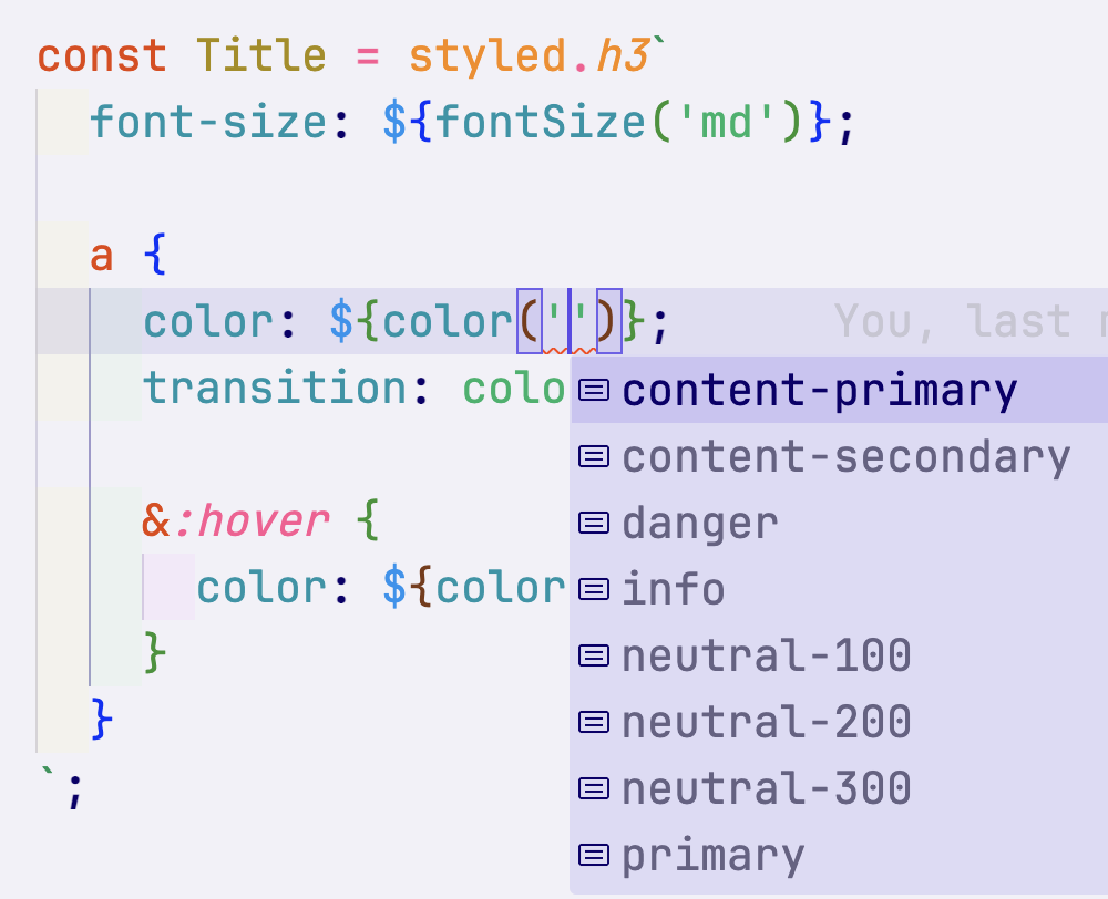
These helper functions are fully typed, and there's also TypeScript IntelliSense for the token names:
See? Problem solved! No manual memorization either.
Currently, I'm using each helper function for each token category for this demo project and this cyishere.dev website. But I'm still wondering if I should use a more generic function for all of them, such as:
// Either theme object is OK; I only need the type of it
export const getCssVariable = <T extends keyof typeof lightTheme>(
  property: T,
  variant: keyof typeof tokens[T]
) => {
  const prefix = getPrefix(propertyPrefixes, property);

  return `var(--${prefix}-${String(variant)})` as const;
};

// and use it like this:
const Button = styled.button`
  background: ${getCssVariable('color', 'primary')};
  font-family: ${getCssVariable('font', 'body')};
  padding: ${getCssVariable('spacing', 'sm')} ${getCssVariable('spacing', 'md')};
`;
I'm not sure which approach is better. For me, I create some snippets in my code editor for all the helper functions since they're basically all the same from project to project. But everyone can choose their own way to find a better suit. This blog post is a general idea for making the tools more friendly and efficient.
3. Summary
Since the purpose is writing CSS and the tool is JavaScript-in-CSS, we can find ways to take advantage of both CSS and JavaScript. Such as the methods in this blog post:
- Use CSS variables
- Utilize JavaScript to create and leverage CSS variables in a friendly and efficient manner.
By using the tokens of a design system, we can improve consistency and make theming easier.
4. Readings
- Unlocking the Benefits of CSS Variables
- CSS Variables for React Devs
- CSS Variables - Why should you care?
- Theming with React and Styled Components (there's a very useful recursive type for complex token definition)
- System-Based Theming with Styled Components