

Last month when I was trying to look for a job and was afraid to take the first step, I immersed myself in building some practical frontend projects. I tried some Frontend Mentor's challenges, but I am not sure whether they're practical enough. So I decided to be a copycat and cloned bejamas.io, actually only the home page (the version before they updated their website at July 15, 2021). Bejamas is very beautiful and elegant in detail; I discovered it a year ago whilst looking up "what is jamstack" and instantly fell in love with this beautiful website. With a live website, I thought it would be definitely practical.
So I took Bejamas' home page as a design template and cloned it with Next.js, styled-components, and Sanity for the "services" and "blog posts" sections (taste some jam). I avoided looking at their source code except copied the CSS code for the box shadow and gradient (😬). It took me an unexpectedly long time to complete it, and some parts are still unfinished.
I've learned a lot during the production process. The following are the lessons:
Mobile-first, but not too first
I've been reading articles about the mobile-first principle. As designers say it's "progress advancement". "First, we build a version for the relatively lower browser which includes the most basic functions and features. Then add interactions, more complicated effects on the basic version for tablet or PC." So I followed this principle to start, then I kinda stuck myself in a corner.
Because I didn't consider the complexity of the desktop version when I started structuring the DOM. That means I'll have to create a completely new DOM structure for a larger screen rather than relying on CSS to do the fancy responsive work. So after spending a significant amount of time refactoring my code, I ended up using three <header>s and letting the media query in CSS decide which one would be displayed which other two would be display: none;. I think it's a little messy.
The lesson I've learned here is although starting with mobile-first, I need to think in the big picture, consider all the variants rather than "abandoning" the version for larger screens at first.
Notes: I attempted to use react-responsive, but due to SSG in Next.js it became a bit tricky. Here's an article about server-side rendering and responsive design. I'd also like to try the dependency fresnel.
Plan first and document well
I tried to implement the concept of re-usable components in this project as much as possible. During coding, I assigned multiple tasks to one component, such as there's a <TwoColumns /> component displayed as grid, because I wanted it to be used in every situation, I put several props on it. Then I forgot what they were and when I was supposed to use which...🤦🏻♀️
The lesson I've learned here is similar to the first one which I need to plan ahead of time, consider all of the possibilities, and write document for them.
There are several tools for writing documents for React projects; however, because this project is small, I decided to convert it to TypeScript in order to use types to specify variant props. (I could use prop-types, but I like TypeScript more and want to use it as much as possible. 😄)
Round dashed gradient border

Bejamas wraps some logos with a round dashed gradient border. It's a minor aesthetic detail, but I spend a lot of time on it, despite the fact that the solution is quite simple. I didn't find the right approach at first. And I put it here: border-image cannot create a round border.
There're two solutions for this style, which I put in a Codepen. I used the second one in this project.
The first is to use a full-color pseudo-element and place it beneath the main element. The main element has a dashed border that matches its background. As a result, the dashed border's gaps reveal the gradient color beneath, giving the appearance of a round dashed gradient border. The key here is to use background-clip: padding-box;.
The second is similar to the first, but instead of layered elements, it employs layered background images. With the help of background-clip the top layer of the background images lets the dashed border reveal the gradient image beneath and produce the same effect as the first one.
Both solutions are straightforward; what matters here is finding the right "mental model". But what I've learned is beyond it: we shouldn't be afraid of something that appears difficult because it may turn out to be simple once we get our hands dirty. (Now, I need to figure out the right mental model for the jar animation in the hero section; still don't know how to make it...😑)
Looping LEGO animation
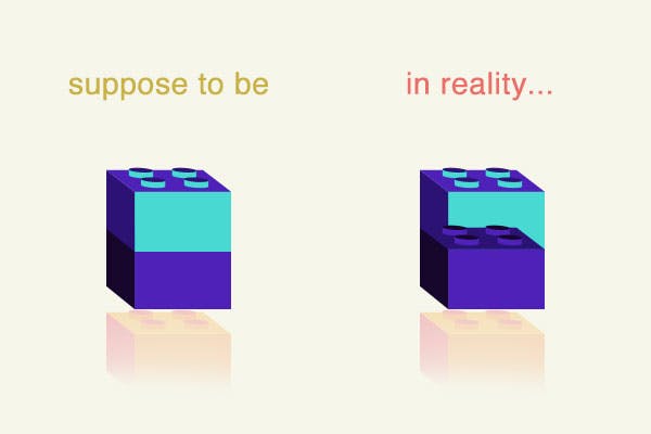
On Bejamas' home page, right after the "round dashed gradient border" section there's a looping animation that stacks three lego blocks on top of each other again and again and again, to infinity and beyond.
The tricky part is that the "boxes" in CSS are a one-way stack. How could I manage to stack the first one on top of the last? From the second loop something that shouldn't have happened occurred as shown in the picture below.

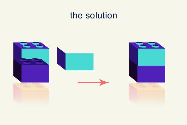
I considered using JavaScript to modify their z-index property but it seems too complicated...So in the end, I came up with a filler which is an extra block to cover up the top of the purple block. With the animation-delay: 4s; the filler starts at the second loop. Here's my code.
It's perfectly functional. Despite the fact that I don't know how to set up an animation-timing-function to achieve that little pause move, I thought this solution was cool until I read Bejamas' code...🤦🏻♀️ Here's the code of Bejamas:
@keyframes loading {
  0% {
    opacity: 0;
    transform: translateY(-70px);
    z-index: 10;
  }
  10% {
    opacity: 1;
  }
  40% {
    transform: translate(0);
    z-index: 1;
  }
  75% {
    opacity: 1;
    transform: translateY(24px);
  }
  to {
    opacity: 0;
    transform: translateY(70px);
  }
}
They change the z-index during animation! I had no idea z-index could be modified in animation! Then I found out that there're tons of CSS properties, not just those pertaining to position (2 dimensions) and appearance, are animatable. Even flex and grid are animatable!
Why didn't I look into if z-index could be animated? I just didn't...
Apparently what I've learned here is code - CSS animation. But, aside from that, I have a feeling there's something else I should be concerned about, and that is thinking outside the box. To be a good developer, I still have a long way to go.
Unfinished parts
Here're some parts in Bejamas' home page I haven't achieved:
- The jar animation in the hero section;
- The "check web vitals" section;
- The blurry effect of the button in the header when it pops in or out;
- The ball pit animation at the bottom of the "Buiding the web" section;
- The blur translucent background of the header;
Whilst I was writing this summary blog post I read Josh Comeau's article "how to learn stuff quickly". I think that learning from creating a clone of a live website is similar to what he meant by "mixing guided and unguided learning". Making alternative solutions and intentional mistakes in order to learn and cultivate a mindset, rather than simply following along with something.